
The VCO logo is an essential element of visual identity. To maintain the longest possible brand life it is recommended to follow the regulations and recommendations of this design manual, which determines how to use the logo correctly.
 The idea of the logo is based on three symbols, which represent a connection with Varnasrama Dharma. One letter of the abbreviation VCO is hidden in each symbol, which is supported by a color so that the letter and symbol are clearly identifiable.
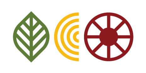
1 Leaf as the letter V — refers to the connection with nature. The leaf has four protrusions on the left and four protrusions on the right, which refer to cooperation between the 4 varnas and 4 ashrams.
2 Field as letter C — refers to agriculture and Mother Earth "Bhumi". The field has four points at the top and four points at the bottom. Thanks to the acurate connection, a connection and the letter C are created, which refers to the cooperation between the 4 varnas and 4 ashrams.
3 Dharma Wheel as the letter O — refers to the social system of Varnasrama Dharma. The Dharma Wheel has four lines on one side and four lines on the other that refer to cooperation between the 4 varnas and 4 ashrams.
Based on these symbols, the pictorial abbreviation VCO was created, which, in addition to the word abbreviation, also communicates the meanings hidden in the individual symbols and can thus better communicate what is the VCO initiative.
Created by Vojtech Kollert in 2020